The properties panel is displayed on the right side of the widget modeler, where the first tab corresponds to general information.
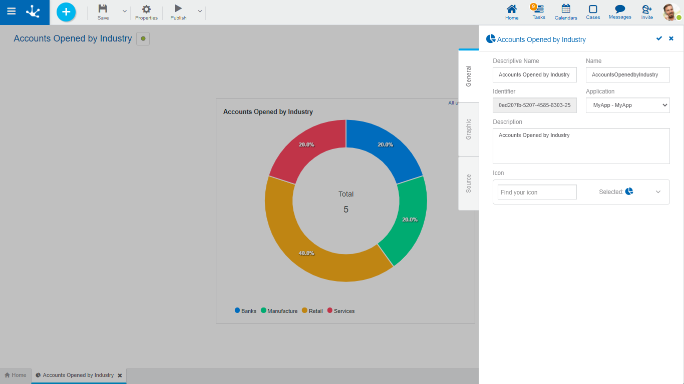
Properties
Descriptive Name
It is the name used by users to reference the widget, for example in the modeler's grid and in the dashboards. It is required.
Name
It is internally used to reference the widget. It does not allow blanks or special characters. It is unique and required.
Identifier
Uniquely identifies the widget. It is automatically generated.
Application
It is the name of the application to which the widget belongs. It is not required, just as it happens with the rest of the modeled objects.
Description
Text that describes the topic the widget allows to analyze, when incorporated into a dashboard.
Allows to incorporate an icon that visually identifies the widget when the operation is made Add widget, from the use of the dashboard.
The list of available icons is displayed to select one of them. The list is reduced as the name is written on the text "Find your icon".
Actions
The icon  is used to confirm the modifications made in the properties panel.
The icon  is used to close the properties panel, if it was not previously saved, changes are discarded.