

Navegación


The menu is a modeler element that allows incorporating a navigation structure within pages and entities. This element enables the build of modern, responsive menus, facilitating the organization of primary navigation, the display of secondary options, and an improved user navigation experience.
The element consists of navigation options that can include text, icons, and an associated submenu, allowing the creation of clear and organized structures with a main menu and a second level of navigation.
Subtypes
The element allows you to choose from different display layouts based on the interface design and the available space.
•Horizontal Menu
•Vertical Menu
•Hamburger Menu
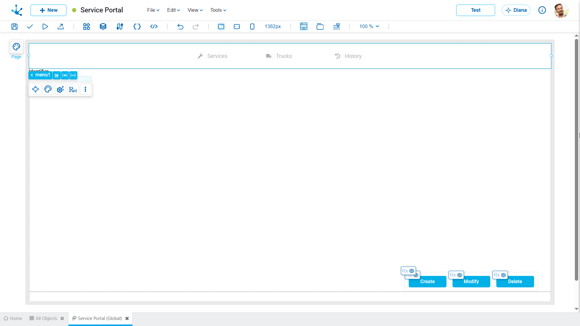
Horizontal Menu
Arranges the options in a horizontal row, side by side. Recommended for top areas of the interface, where there are only a few primary options and sufficient horizontal space is available.
Vertical Menu
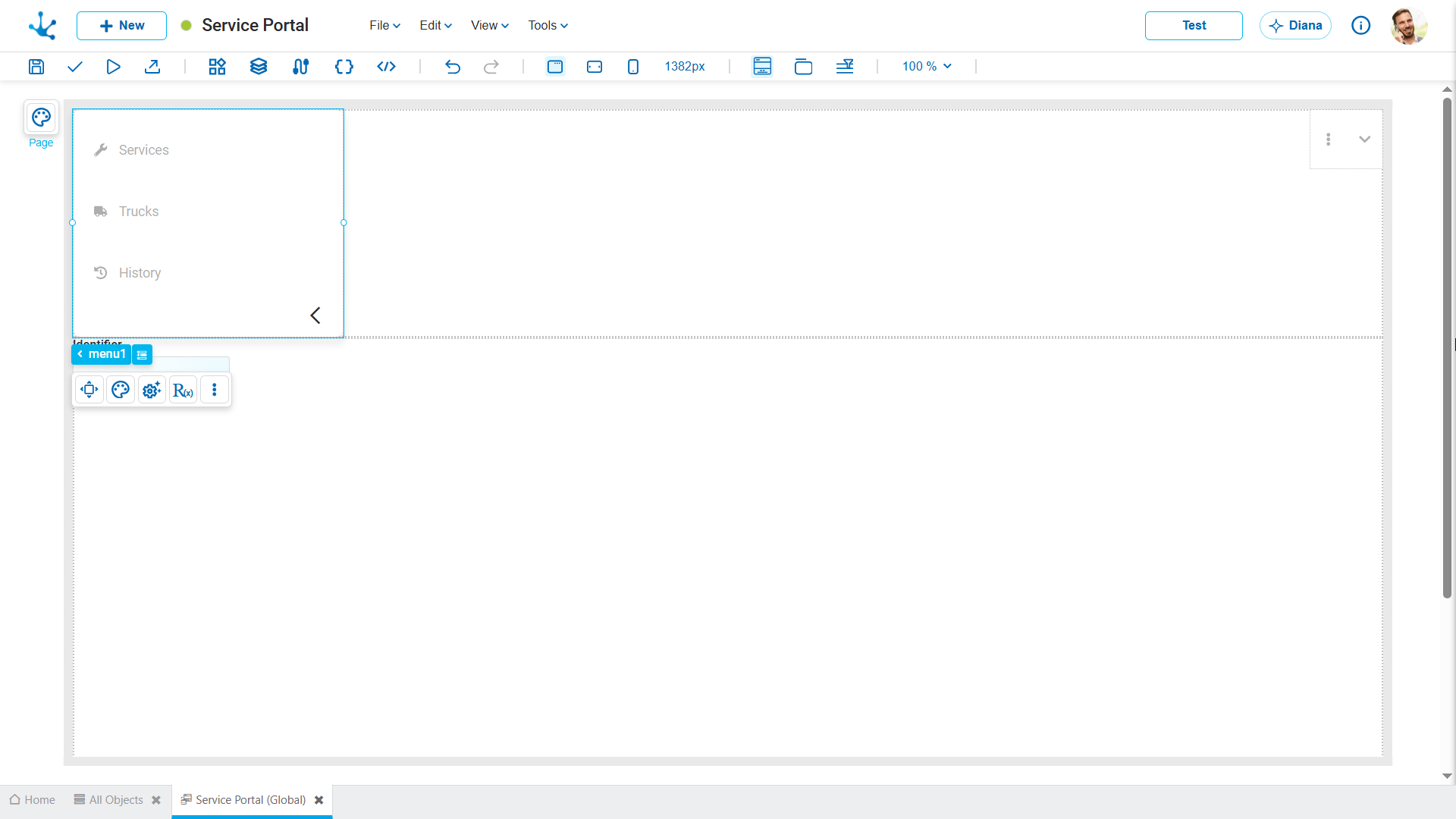
Arranges the options in a vertical column, one below the other. It is especially useful for side menus or interfaces with numerous options, as it facilitates the organization and access to the different navigation elements.
Hamburger Menu
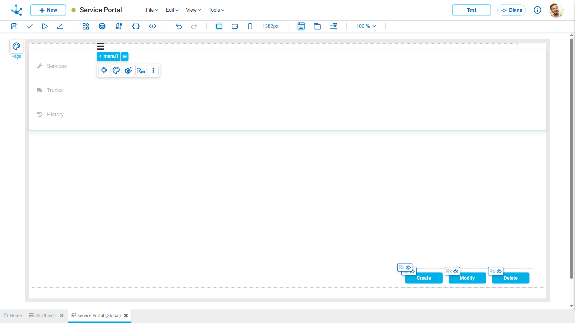
Groups the navigation options within an expanded menu accessible through an icon. Recommended for interfaces with limited space, responsive designs, or scenarios where navigation does not need to remain permanently visible.
Structure
The "Menu" element is organized into different levels.
•Menu
•Menu Item (Main option)
•Submenu Item (Secondary option)
Building and Editing
When the "Menu" element is dragged onto the modeling area, it is automatically created with an initial structure consisting of one menu and three menu Items (primary options).
Add Main Options
To add new primary options, select the menu in the breadcrumb. By doing so, the following action becomes available:
•Add Menu Item, which allows the addition of new main options to the menu structure.
Each menu Item can be configured from its properties panel.
Add Submenus and Groups
When selecting a menu item in the breadcrumb, the following actions are available:
•Add Submenu Item to incorporate a new secondary option.
•Add Submenu Group, to build an organizational group within the submenu.
When the first submenu item or the first group is added, the submenu associated with the selected menu Item is automatically created.
From that moment on, the submenu becomes part of the element structure and is displayed in the breadcrumb, where it can be selected to access its properties and manage the secondary options and groups it contains.
This approach allows the navigation structure to be built progressively, adding the submenu only when needed.