
Style Properties


The style properties panel of an element opens when selecting the icon  of its context menu.
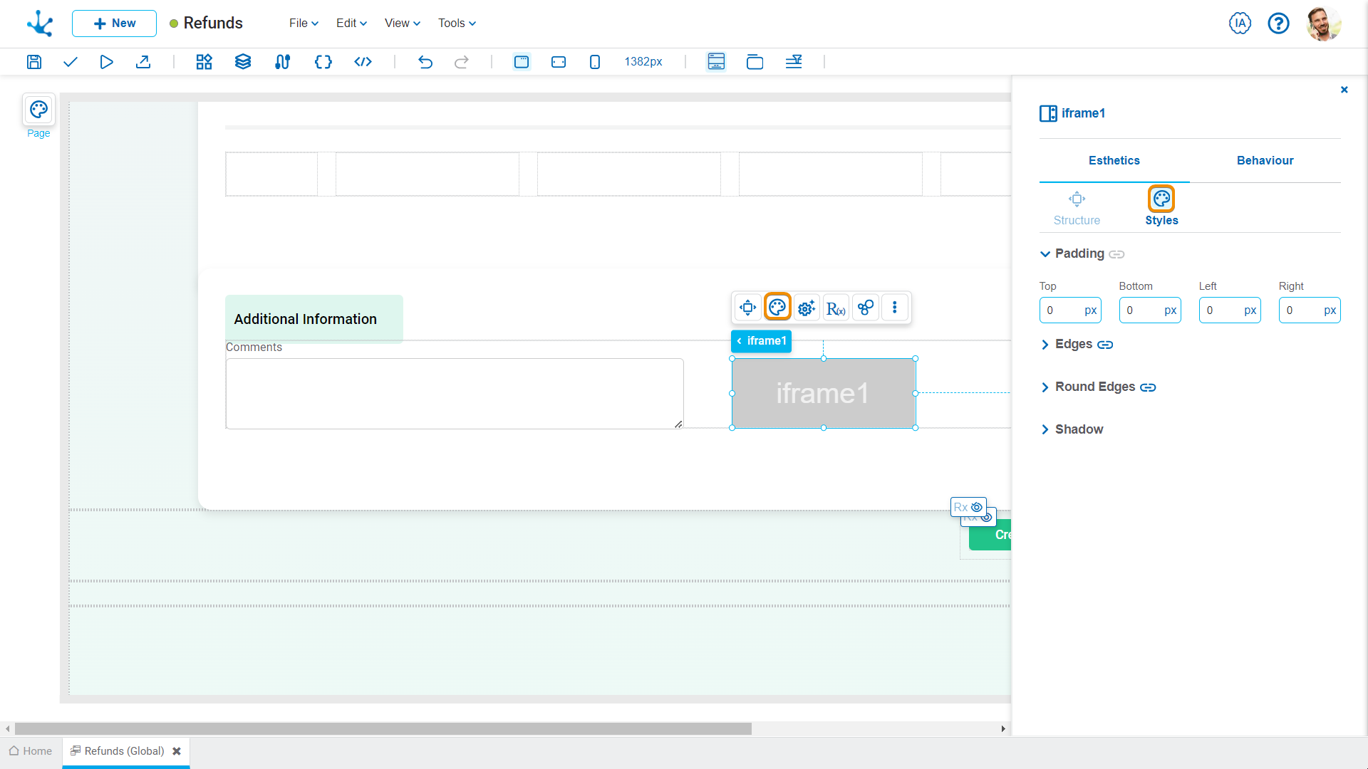
Styles
 It allows copying the entire current configuration of the style panel for the selected element (Ctrl+Alt+C).
 It allows applying the previously copied configuration to another element of the same type (Ctrl+Alt+V).
Padding
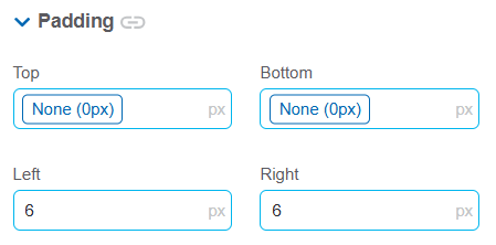
These properties allow defining the space between the borders (top, bottom, left and right) of the element and its content. Padding is applied to the inside of an element, unlike margin, which defines the space between the element and the element above it. It is recommended to define its value using one of the layout system spacing variables to ensure interface consistency. If a required value is not available in the spacing scale, a fixed value can be specified.
 Allows values entered in one of the paddings to be copied to the other ones automatically.
 Allows to indicate different values for each padding.
Edges
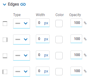
It allows to define the style of borders. Each one has its type, width, color and opacity defined, the latter as a percentage.
Allows the value entered in one of the borders to be copied to the other ones automatically.
Allows to indicate different values for each border.
Round Edges
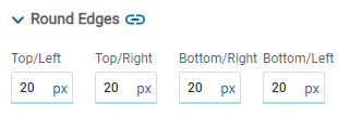
It allows to define the round edges at the corners of elements.
It can be expressed in pixels (px), percentage (%), viewport width (vw), and viewport height (vh).
Allows the value entered in one of the borders to be copied to the other ones automatically.
Allows to indicate different values for each border.
Shadow
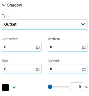
Allows to define a shadow effect around the element.
Type
Possible Values
•Outset
•Inset
Horizontal
Horizontal size of the shadow to the right of the element. It can be expressed in pixels (px), percentage (%), viewport width (vw), and viewport height (vh).
Vertical
Vertical size of the shadow below the element. It can be expressed in pixels (px), percentage (%), viewport width (vw), and viewport height (vh).
Blur
The greater this value is, the greater and lighter the shadow becomes. If not specified, its value is 0 and the shadow border is darker. It can be expressed in pixels (px), percentage (%), viewport width (vw), and viewport height (vh).
Spread
Positive values will cause the shadow to expand and grow bigger, while negative values will cause the shadow to shrink. If not specified, its value is 0 and the shadow will have the same size as the element.
Color
Defines the color of the shadow.
Transparency
Defines the transparency of the shadow.
Tooltip
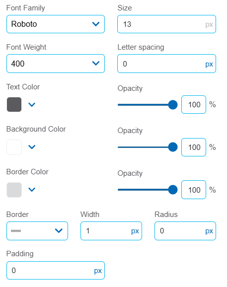
Source
It allows customizing the font, size, thickness and letter spacing of the pop-up message.
Colors
The color and opacity of the text, background and border can be defined. Borders are set uniformly for all sides of the tooltip.
Border
The border type, width, and border radius can be configured.