The second tab in the side panel corresponds to the additional properties to define the behavior and functionality of a field.
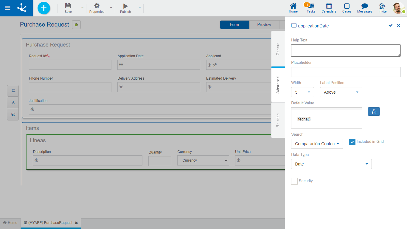
An asterisk "*" on the label indicates that the property is required.
Properties
Help Text
Its function is to guide the user on the content to load in the field. The text entered as help is displayed when the user hovers the cursor over the field.
Placeholder
Its function is to guide the user on the content to load in the field. Unlike the Help Text property, the text entered as a placeholder is displayed within the field.
Width
It is used to modify the field width in the row. Values between 1 and 12 can be selected, where 12 is the total row width.
Defines where the label is placed in the form instances, in relation to the control that it identifies. By default it is at the top and can be changed to the right or left of the control.
The result of indicating this property is displayed in the design option "Preview”.
Multiline
This property determines if the field is displayed in text box mode when using the form, allowing the edition of the text in a larger area. This property is only visible if the field is text type.
Allows to assign the value the field has by default at the time of the first data entry, to speed up the loading of values. The default values can be constant values or can be defined from the functions available for the field type. Each function returns a value when using the form and results of more than one function can be combined with text.
Search
Allows to use the field as filter when searching for instances of the form.
Indicates if the field is displayed in the results grid where the form instances are shown.
Data Type
Determines the data format that can be entered in the field. The supported data set varies, depending on the type of field that has been created from the elements of the left side toolbar.
Length
Determines the maximum length of the value depending on the data type. This attribute is only visible if the field is of text or numeric type.
This property is valid only for the identifier field, It allows to uniquely identify a form instance, that is, such value cannot be repeated between instances of the same form.
Autonumeric
This property is valid only for the identifier field and determines that the field value is automatically generated when creating the form instance.
This property is valid only for text type fields. If email value is selected in this property, the field content becomes the recipient when sending an email from a form instance.
Security
This property is used to define display and editing restrictions on the field that is being modeled.
If this property is checked, the security functions of field view and editing are created and they are displayed in the use functions panel of the design option "Permissions” of the form, if they are checked, they are incorporated into the form’s security functions assigned to the created or modified permission.
This property is only visible if the field is of "Check'' type. Allows to select whether the field is displayed in “Check” or “Toggle” format.''.