Configuration Properties


The configuration properties panel of an element opens when clicking the icon  of its context menu.
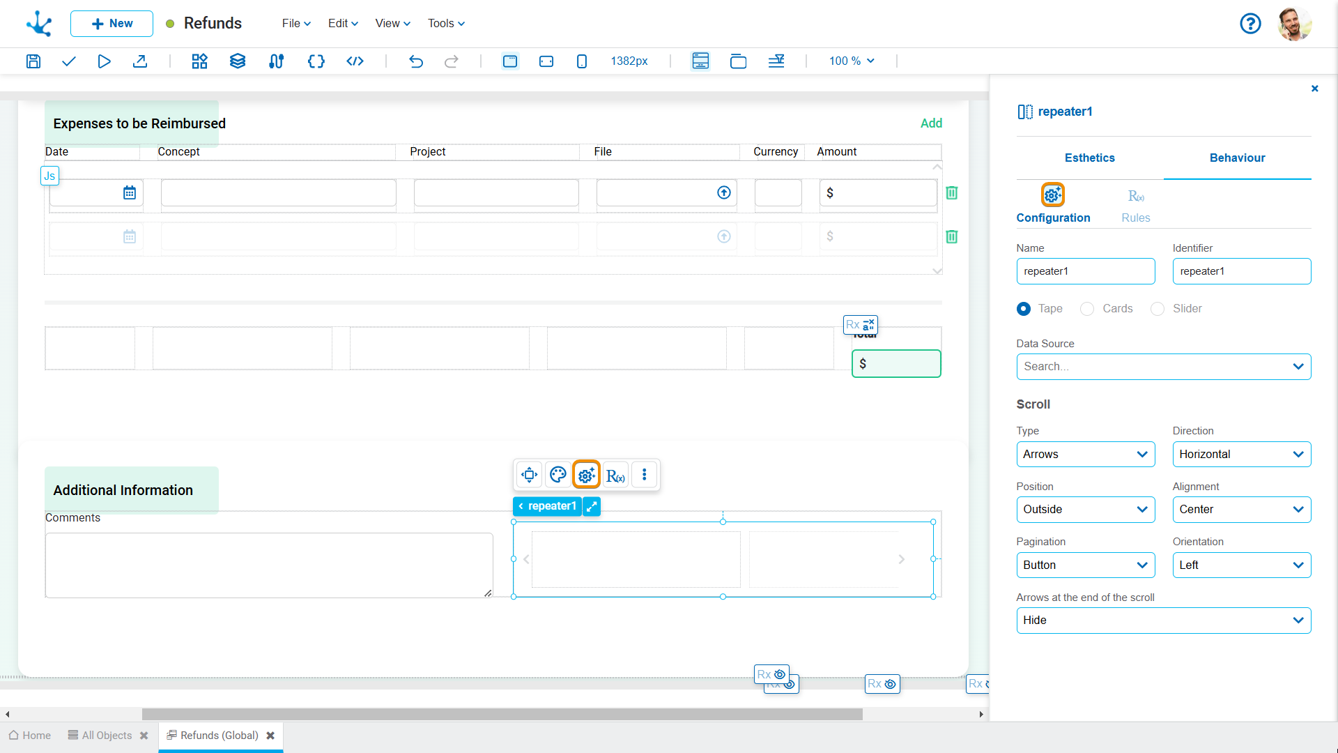
Name
Name used to reference the element during modeling.
Identifier
Uniquely identifies the element. It is used in the Javascript SDK.
Tooltip
Pop-up message that appears when hovering over an element, providing additional information.

Text
Content of the message being displayed.
Direction
Position of the message in relation to the element (top, bottom, left, or right).
Items can be repeated in tape, card, or slider format.
When the entity is executed, the items scroll within the repeater as the forward and backward icons are pressed. The number of items initially displayed on the tape depends on the size of the repeater.
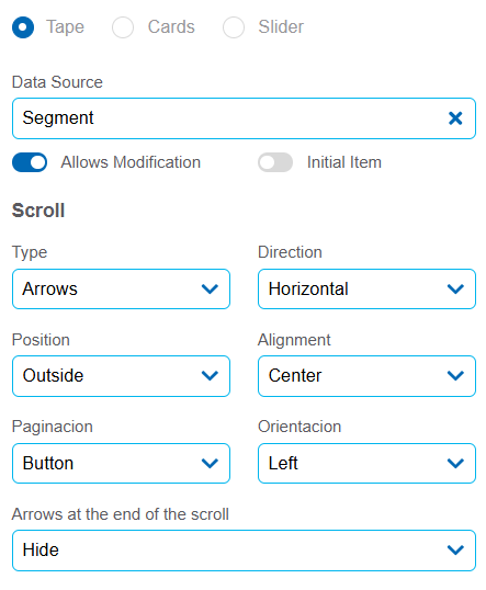
Data Source
It allows selecting the source from which the data displayed on the repeater is retrieved. Once the source is selected, the Allows Modification property is enabled.
Allows Modification
It allows adding or removing items from the repeater using a modeled hyperlink. If the property is not activated, the number of items is fixed and cannot be modified. When activated, the Initial Item property is displayed.
Initial Item
It allows adding an empty item to the repeater using a modeled hyperlink.
If the repeater is empty at runtime, the initial item is automatically added, without the user needing to use the hyperlink.
Type
If the entity is used from a desktop, the “Arrows” option should be selected so that the icons  and
and  indicating the forward or backward movement of the items on the tape are enabled. If used from a touch breakpoint, the “None” option can be selected to perform the scrolling.
If the selected value is “Arrows” the enabled properties are: Position and Alignment.
Possible Values
•Arrows
•None
Direction
Allows to select the direction in which the items within the element are displayed.
Possible Values
•Horizontal
•Vertical
Position and Alignment
Select the position of the scroll icons within the repeater.
Possible Values for Position
•Top
•Bottom
•Inside
•Outside
Possible Values for Alignment
•If the “Inside” or “Outside” values are selected for the Position property, the possible values of the Alignment property are: “Top”, “Center”, “Bottom”.
•If the “Top” or “Bottom” values are selected for the Position property, the possible values of the Alignment property are: “Left”, “Center”, “Right”.
Pagination
Defines how the elements of a repeater are loaded and displayed in the entity.
Possible Values
•Button: Loading more items is triggered manually, the user must click on a button labeled "Upload more" to show additional elements.
•Infinite: elements load automatically as the user scrolls down the entity. This behavior is known as infinite scroll.
Orientation
Defines the position at which the pagination element appears within the repeater container.
Possible Values
•Left: the pagination element is aligned to the left side of the container.
•Right: the pagination element is aligned to the right side of the container.
Arrows at the end of the scroll
Defines the behavior of the navigation arrows when the last element is reached.
Possible Values
•Disable: The scroll arrows are disabled, indicating that there is no more content.
•Hide: Scroll arrows disappear completely, avoiding unnecessary navigation elements to be presented.
Unlike the tape, the items paginate within the repeater as the forward and backward icons are pressed. The number of items that are initially displayed in the repeater depends on the values modeled in the Columns and Rows properties.
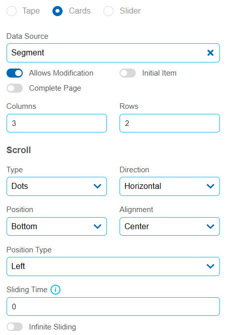
Data Source
It allows selecting the source from which the data displayed on the repeater is retrieved. Once the source is selected, the Allows Modification property is enabled.
Allows Modification
It allows adding or removing items from the repeater using a modeled hyperlink. If the property is not activated, the number of items is fixed and cannot be modified. When activated, the Initial Item and Complete Page properties are displayed.
Initial Item
It allows adding an empty item to the repeater using a modeled hyperlink.
Complete Page
Automatically adds the necessary empty items to the repeater to reach the total quantity defined in its modeling, via a hyperlink
If the repeater is empty at execution, the initial item is automatically added or the defined number of items is completed and the user does not need to use the hyperlink.
Columns
It allows defining the number of columns in the repeater.
Rows
It allows defining the number of rows in the repeater.
Type
Defines the type of control to move forward or backward between the groups of items visible in the repeater.
Possible Values
•Dots: each dot represents a group of visible items and they can be selected to change the view.
•Arrows: icons on the sides that allow moving forward or backward through groups of items..
•Pages: combines arrows with page numbers. The user can navigate between pages using arrows or access one directly. Up to two pages before and after the current one are displayed, with ellipses if there are more. The active page is highlighted to indicate the current position.
Direction
Allows to select the direction in which the items within the element are displayed.
Possible Values
•Horizontal
•Vertical
Position and Alignment
Select the position of the scroll icons within the repeater.
Possible Values for Position
•Top
•Bottom
•Inside Top
•Inside Bottom
Possible Values for Alignment
•Left
•Center
•Right
Position Type
It allows defining how cards are aligned within their container.
Possible Values
•Left
•Centered
•Right
Sliding Time
It allows defining the interval in seconds for the automatic transition between cards.
Infinite Sliding
It allows the card type repeater to slide continuously, returning to the beginning once the end is reached.
It behaves similarly to the Tape-type repeater, offering additional features to customize its behavior. It is designed to show and focus on a single element at a time.
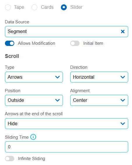
Data Source
It allows selecting the source from which the data displayed on the repeater is retrieved. Once the source is selected, the Allows Modification property is enabled.
Allows Modification
It allows adding or removing items from the repeater using a modeled hyperlink. If the property is not activated, the number of items is fixed and cannot be modified. When activated, the Initial Item property is displayed.
Initial Item
It allows adding an empty item to the repeater using a modeled hyperlink.
If the repeater is empty at runtime, the initial item is automatically added, without the user needing to use the hyperlink.
Type
Defines the type of control to move forward or backward between items in the repeater.
Possible Values
•Dots: each dot represents an item and they can be selected to change the view.
•Arrows: icons on the sides that allow moving forward or backward one item at a time.
•Pages: combines arrows with page numbers. The user can navigate between items using arrows or go directly to a specific one. Up to two items before and after the current one are displayed, with ellipses if there are more. The active item is highlighted to indicate the current position.
Direction
Allows to select the direction in which the items within the element are displayed.
Possible Values
•Horizontal
•Vertical
Position and Alignment
Select the position of the scroll icons within the repeater.
Possible Values for Position
•Top
•Bottom
•Inside
•Outside
Possible Values for Alignment
•If the “Inside” or “Outside” values are selected for the Position property, the possible values of the Alignment property are: “Top”, “Center”, “Bottom”.
•If the “Top” or “Bottom” values are selected for the Position property, the possible values of the Alignment property are: “Left”, “Center”, “Right”.
Arrows at the end of the scroll
Defines the behavior of the navigation arrows when the last element is reached.
Possible Values
•Disable: The scroll arrows are disabled, indicating that there is no more content.
•Hide: Scroll arrows disappear completely, avoiding unnecessary navigation elements to be presented.
Sliding Time
It allows defining the interval in seconds for the automatic transition between cards.
Infinite Sliding
It allows the card type repeater to slide continuously, returning to the beginning once the end is reached.


