Components


The design system of Deyel includes components that, when configured and used correctly, ensure the uniformity and visual quality of applications.
Within the "Elements" tab of the left panel, subtypes are configured to standardize the behavior and appearance of user interface elements.
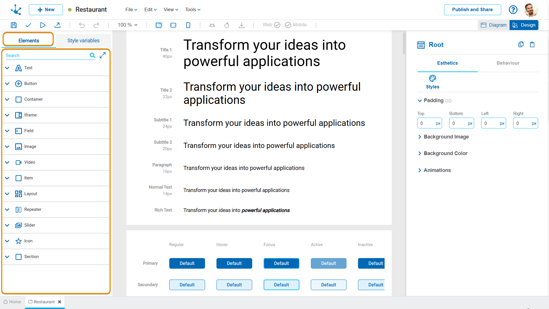
For the different types of elements in the design system of Deyel, their subtypes must be reviewed or configured, by defining their properties, such as color, size, spacing and hierarchy, in accordance with the application’s visual identity.
Text
•Check the hierarchy of texts on the pages and configure the design system to match.
•Verify that the fonts match the defined typographic variables.
•If the default text subtypes are not sufficient, new ones can be built by assigning them a name and a clear description.
Button
•Define the width and the style of the buttons.
•Check the font used.
The procedure for configuring the subtypes of buttons is similar to that of texts.
Field
•Define working width. For example, 12% or 100%.
•Detect the most representative field to take it to the SD.
•It is essential to verify that the subtypes are not in a "modified" state on the pages; if so, the modified property should be reviewed and the subtype reassigned or the modification standardized in the SD if it is valid.
Other Types of Elements
For the remaining element types, the same principles of review, identification, and subtype configuration described for texts, buttons, and fields must be applied.
Once an element has been identified, its properties can be copied and applied to the specific subtype in the design system.
New Subtype
A new subtype of an item can be created by clicking on the icon  of the selected base subtype.

When doing so, a panel opens that allows defining the name and description of the new subtype.

Once created, the subtype must be configured in the properties panel and the application published.
Repeat these steps for the subtypes that are not available by default in the design system panel, paying special attention to the styles configured according to the element type.
A font family is a set of typefaces that share the same basic design but vary in aspects such as weight (light, regular, bold), style (italic, condensed, extended), or width. Furthermore, it structures the interface, since it not only fulfills an aesthetic role, but also hierarchically organizes the information and guides the user's navigation within the application.
In the design system of Deyel, the following fonts are distinguished:
•Primary font: It is the main font that structures the interface, facilitates reading, and contributes to a clear and orderly appearance. It should be sufficient for most of the text in the application.
•Secondary font: Its use is exceptional and is reserved for situations where the hierarchy of the primary typographic variables is not sufficient to generate the desired contrast. Its definition is optional.
It is defined in the tab "Style variables" of the left panel.
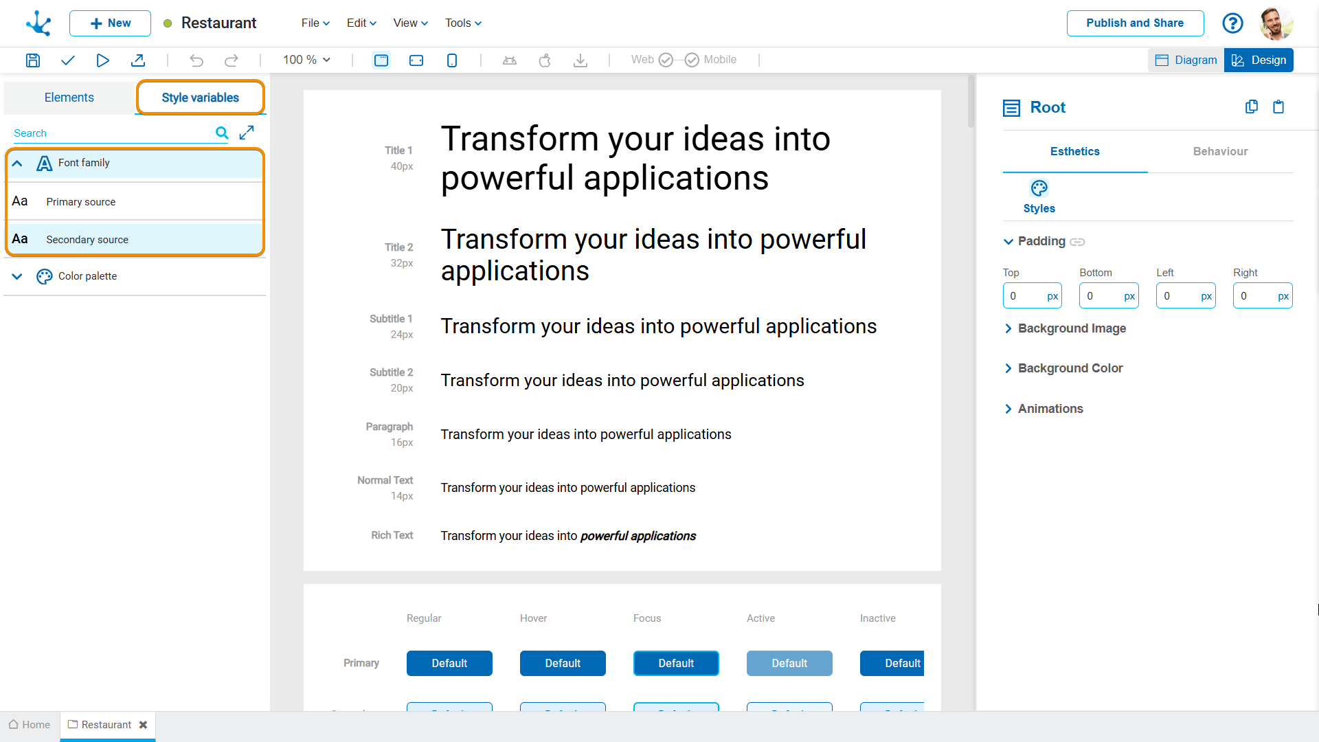
New fonts can be created by clicking on the icon .

When doing so, a panel opens that allows defining the name, family and description of the font.

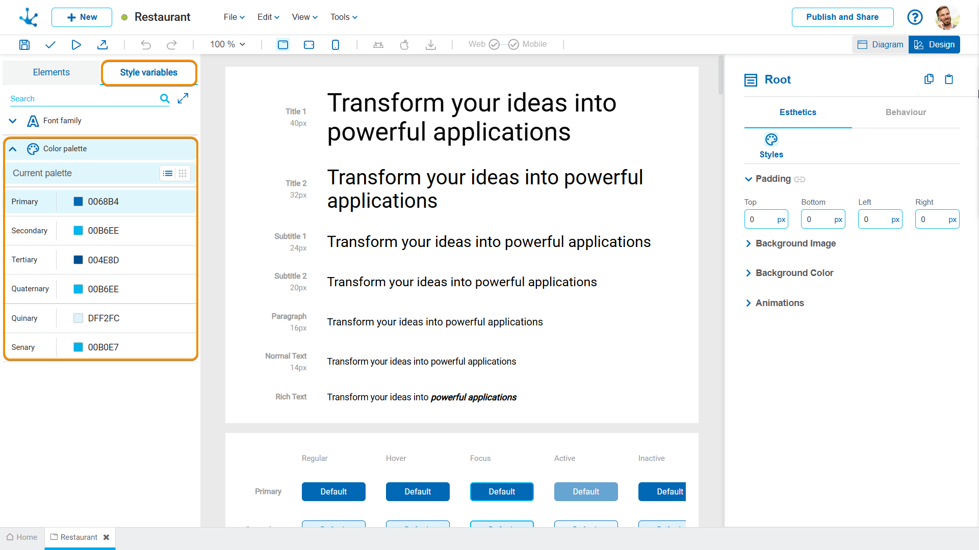
The color palette is essential for visual identity and information hierarchy. In the design system of Deyel, colors are organized around the theme modeled in the application and according to specific criteria.
The choice of palette should be based on brand identity, accessibility (contrast and legibility) and visual consistency throughout the entire application.
The palette configuration is structured around functional roles of color, rather than application modeling. These roles determine their use and visual weight within the application.
•Primary criterion: It represents the brand or main tone of the application. It is applied to key components that guide the user's attention. It occupies approximately 30% of the visual weight and is used for main interface elements.
•Secondary criterion: It complements the primary color and reinforces the visual hierarchy. It occupies 10% of the visual weight and is used to highlight elements such as links, buttons, borders or specific parts of components (highlights).
•Tertiary criterion: It defines the background and content areas, ensuring contrast and readability. It provides visual stability and forms the structural basis of the interface. It constitutes 60% of the visual weight and is the basis of the structure, that is, the background color of the interface.
It is defined in the tab "Style variables" of the left panel, next to the font family.


